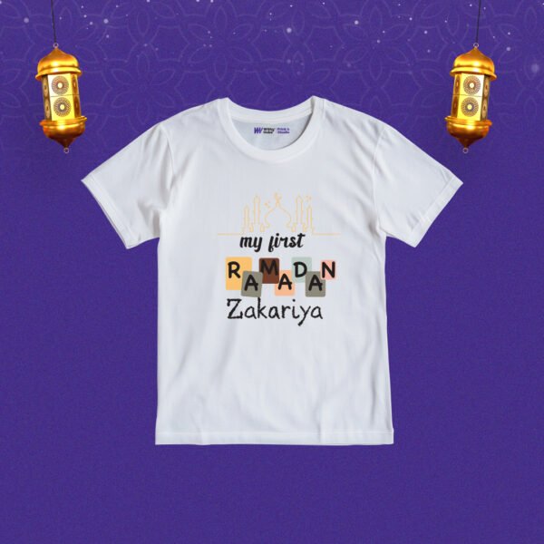
-25%


First ramadan mohd kashif Customized Tshirt
Original price was: ₹800.00.₹600.00Current price is: ₹600.00.

Eid mubarak kashifa sidhiqui Customized Tshirt
Original price was: ₹800.00.₹600.00Current price is: ₹600.00.


-25%
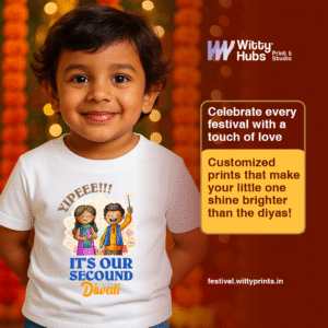
Its Our Second Diwali Customize T-Shirt
Original price was: ₹800.00.₹600.00Current price is: ₹600.00.
-21%

Little Deepam Of The House harika Customize romper
Original price was: ₹950.00.₹750.00Current price is: ₹750.00.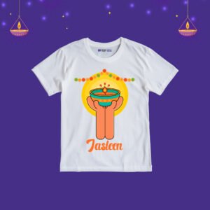
-25%
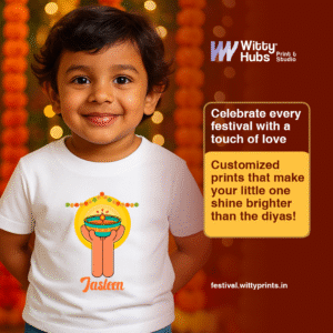
Happy Diwali Jasleen Customize T-Shirt
Original price was: ₹800.00.₹600.00Current price is: ₹600.00.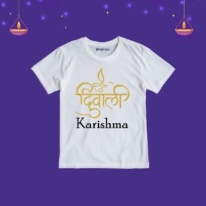
-25%
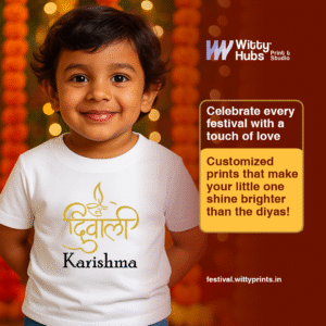
Happy Deepawali Customize karishma T-Shirt
Original price was: ₹800.00.₹600.00Current price is: ₹600.00.
-21%

Reviews
Clear filtersThere are no reviews yet.